Logo idea
Appearance
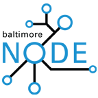
So I was playing around with this idea for a logo. What do you guys think? Any other ideas? Kellyegan 01:22, 9 July 2009 (UTC)
See possible ideas at node flickr group. Kelly's Flickr Page (with the logos)
- When Adam and I first got together I had the idea to make a component based crab. The idea was to use a crab shell with LEDs for eyes, disk capacitors for claws, and resistors for legs. I havn't sat down with my girlfriend to draft it up yet so i'll try to do that this weekend. Mehuman 02:27, 9 July 2009 (UTC)
- That's pretty sweet Kelly, I like it. 12.167.154.53
- I really like it. What's the type you're using? Jon and I are guessing Avant Garde. Anyways, I would tweak "Baltimore" a little bit. I think it also needs a little vertical padding from "NODE." Maybe also try doing it in a condensed type, or in lowercase perhaps? It'd be nice if the network-y shape corresponded to something in Baltimore - like some major streets near our future physical home. Sylviachi 21:20, 9 July 2009 (UTC)
- I really like the idea of having the traces blue and the Baltimore text black. I think it really gives the logo a -techie- feel. -Mdshw5 19:18, 10 July 2009 (UTC)
- I'm digging it. The all black versions work well on colored backgrounds, but the two-color versions feel best on white. I like the uppercase corbel the best. Blue traces with black, more thinly stroked circles seems worth a try. The sooner we can get a logo that the majority is happy with the sooner we can flesh out the Node's visual identity and unify designs across web, wiki, and blog. I think that later this week we should set up a timeframe for people to comment or submit their own logo deigns so we can wrap it up by the end of July. --Jonlesser 05:49, 14 July 2009 (UTC)
- I dig it. Not into crab icons. --Erich Steiger 02:31, 16 July 2009 (UTC)
