Baltimore Node Logo: Difference between revisions
| Line 26: | Line 26: | ||
===Typeface=== | ===Typeface=== | ||
I really can't get behind the way it renders lowercase "baltimore". I want to re-voice my vote for condensed helvetica neue. [[User:Sylviachi|Sylviachi]] 16:26, 2 September 2009 (UTC) | I really can't get behind the way it renders lowercase "baltimore". I want to re-voice my vote for condensed helvetica neue. [[User:Sylviachi|Sylviachi]] 16:26, 2 September 2009 (UTC) | ||
===Color=== | |||
I really miss the pop of the brighter, more cyan, blue. It feels muddy and muddled to me with the decreased contrast of the darker blue. It's like the logo got punched in the face and now it's all bruised. [[User:Jonlesser|Jonlesser]] 17:32, 2 September 2009 (UTC) | |||
Revision as of 17:32, 2 September 2009
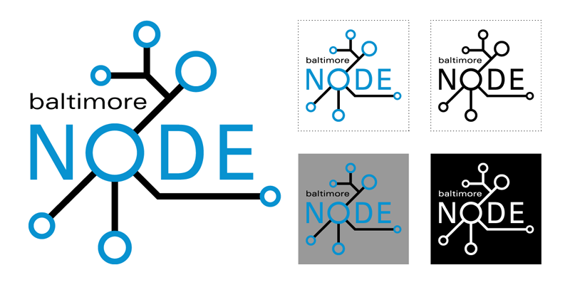
Main design with possible variations
No need to decide between them as they could all be used for different situations.

Various files for editing
I'll upload some vector files an other version so that people can edit, tweak and use various versions. - Kellyegan 14:43, 2 September 2009 (UTC)
Transparent PNG (for various web uses)
Vector versions
- SVG version (Can't upload. File type not supported)
- AI (Doesn't seem to like Illustrator files either)
- PDF (finally) File:Logo.pdf
(I just added eps, ai, and svg to the supported upload file typesJonlesser 17:31, 2 September 2009 (UTC))
Comments / Critique
Typeface
I really can't get behind the way it renders lowercase "baltimore". I want to re-voice my vote for condensed helvetica neue. Sylviachi 16:26, 2 September 2009 (UTC)
Color
I really miss the pop of the brighter, more cyan, blue. It feels muddy and muddled to me with the decreased contrast of the darker blue. It's like the logo got punched in the face and now it's all bruised. Jonlesser 17:32, 2 September 2009 (UTC)

